Author Archives: fentlegen
Peer reflection log
As per the brief specification, I was given a number of peers working on similar projects with whom I was to closely follow and consult on Behance. However this did not go all too well. My assigned peers were Tone Persson and Rebecca Monaghan. As the semester continued Tone would change her brief to be less about characters and more about game assets, thus widening the gap between our disciplines. Never the less I tried as often as I could to leave feedback on each persons project where I could (although with Tone this was often while speaking to her since we often work together).
In an attempt to compile our interactions, I will provide links to the relevant pages on Behance below.
Myself critiquing Tone:
https://www.behance.net/wip/980809/1871251
Tone critiquing myself:
https://www.behance.net/wip/1113743/1985145
Myself critiquing Rebecca:
https://www.behance.net/wip/1007253/1807113
Rebecca critiquing myself:
https://www.behance.net/gallery/23343469/Photostudies-of-Friends-(CAP-Development)#comments
Semester 2 in Relection
Looking back on this semester I am extremely pleased with my progress. I feel this project has taught me a lot and I have most most certainly evolved and grown as an artist. Although I still have further to travel I am much more confidant with my work than I was before. I used to hate drawing/painting faces and would instead design characters with masks or other similarly obscuring items. Either that or I would draw them in a stylised manner so as to avoid detail.
Now though, I feel I understand faces and heads a lot better. Using this project as a tool to force myself into studying my artistic nemesis (or at least one of them) and addressing my short comings has allowed me to overcome many of them. That’s not to say I don’t still have a lot which can be improved, I still struggle with a number of areas.
One such area is natural skin tones, which I still have a tendency to render as very brown or tobacco. That being said, I have improved in this area and can now recognise and fix my errors with adjustment layers. I would still like to be able to avoid the problem in the first place though.
Another area which I still need to improve on is constructing faces from my imagination. However this was never specifically part of the brief, which was focused on teaching me only how to paint faces. As such I used photos of friends and online models as reference throughout the project. This has allowed me to learn many of the commonalities in facial structure and how best to paint them.
Hence, I think that learning to draw faces from the imagination is the perfect continuation of this project and I plan to do this over the summer break. Hopefully this will mean that I can return to fourth year with my skills at facial rendering significantly improved. Then all I need to do is improve on the rest of anatomy.
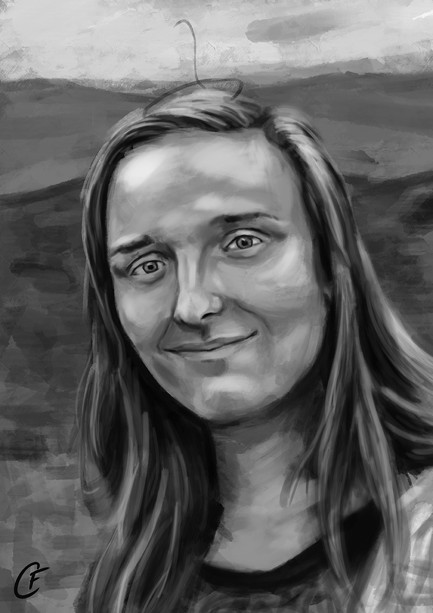
Submission Piece 3: Expressionistic Portrait

This is the third and final submission piece for my second semester of Computer Arts Practice, an expressionistic self portrait.
I had a lot of issues with this portrait, but I am happy with it as the finale to this project. My main issue was getting the colours mentioned in my previous post to work harmoniously with each other. The obvious issue was how in-your-face the colours were, I could have created an Andy Warahol pop art eye-sore, but I have never been a big fan such bright vibrant images. In my opinion such bright and vibrant colours need to be balanced with ones softer on the eye, otherwise the image is too garrish. As such I began by trying to use the colours chosen to compliment the natural colours of the piece, using them to alter shades and highlights (as I have done in pieces like Photostudy 8 and Photostudy 9).
However this produced its own problems because I then struggled to blend the abstract colours with the realistic, which were quite brown/tobacco due to my previously mentioned struggles. Browny-yellows do not blend well with magenta and lilac it turns out. I was eventually able to overcome this problem by further implementing the abstract colours and having them completely override the natural tones. I also inverted the background, which was initially yellow and magenta. This made the overall piece too hot, and I did not want too many cool colour on my face as it would render me cold and negative, the opposite of the traits I was trying to present. However the blue background is much more calming and balances the piece well.
Whilst this has resulted in a pleasing and soft application of the otherwise gaudy colour scheme, it was the result of a far too much time and effort. Never the less I am pleased with the results of this piece and am glad to have it as the finishing piece of this project.
A WiP can be found on my Behance: https://www.behance.net/wip/1113743/1993031
And I have produced another progress gif.

Colour Scheme for Expressionistic Piece.
As with my previous expressionistic pieces, I want the colour scheme of my final expressionistic piece to be inspired by words used to describe the subject. And in a grand egotistical finale to this project I have decided to create a self portrait, as opposed to painting a friend.
Now, I could have chosen the words which describe me myself. However, what I liked about the previous portraits was that the colour scheme was not entirely influenced by me, and had another’s thoughts put into it. With this in mind, I decided to spin the idea on its head. I asked each of my friends who I have drawn in this project to provide me with one or two words which they would use to describe me (a bold move I know) and from these I created a colour scheme. Luckily, a number of the words overlapped and so I was not overwhelmed.
 From this list I obtained the following colours.
 Red: Stubborn, driven, obstinate
Crimson: Determined.
Magenta: Kind, flamboyant
Teal: Trusting, reliable, committed.
Sky Blue: Selfless, kind.
Lilac: Immature, glamorous.
This is a very bright and clashing colour scheme, and I’m not entirely sure how much of it I will be able to incorporate into the final piece. Because of this I made some quick tests to explore different ways it could be applied.

As you can see, the colour scheme is very in your face and difficult to balance across a portrait. However, I think a combination of the middle portrait (which aims to paint with the colours themselves) and the right portrait (which uses the colours to compliments natural shades) could produce a harmonious portrait that displays the emotions I want it to.
Submission Piece 2: Colour Portrait

The second of my submissions pieces is this coloured portrait. I decided to paint Louise again because I had a nice photo of her which had a mixture of warm and pale light, the main source of light is a warm one, but the blue parasol causes it to cool/pale as it passes through. This provides an dynamic contrast which I thought would be excellent for testing my skills.
I still have some issues with painting realistically colour portraits, particularly when it comes to skin tones. Although I have improved significantly since the beginning of this project, I continue to struggle with picking healthy skin tones. I often begin with a very brown/tobacco skin colour without realising, and then have to breath life into with adjustment layers. Despite this I am much more confidant with my colours, even if I do get them wrong initially I now understand that they are wrong and know how to correct them. As can be seen in the portrait, I managed to avoid a lot of these unhealthy tones and keeping the face warm even in the pale light.
Furthermore, my brushwork has also improved. At the start of this project I would often paint in shapes, aiming to fill in an area of colour/shade. This had the effect of creating multiple conflicting brushstrokes and tangents which pulled the eye in every direction. I think this portrait shows my improvement in this issue. I now understand that I can use my brush strokes in harmony with the structure of the face, following the direction of muscles or locks of hair. This can especially be seen in the cheeks and eyes of the portrait.
There are some areas of this portrait which still cause issues, particularly the expression. I think the mouth is fine but I had some difficulty with transferring the happiness into the eyes (eyes are still an issue for me it seems). They almost show it but are in that middle ground were they haven’t quite reached happiness and just look dead/unfocused instead. Upon reflection I think this could be rectified by raising the lower eyelids, but I just don’t have the time to fix it at this point.
Overall I am extremely pleased with this piece, despite the mentioned issues, and I think it is an excellent example of my improvement this semester.
As usual, a WiP can be found of Behance: https://www.behance.net/wip/1107461/1980229
And I have produced a progress gif:

Submission Piece 1: Greyscale Portrait
 This is 1 of my 3 final submission pieces, a greyscale portrait (I wrote monochrome in the brief but this was so I could have some flexibility with it if I wanted to). I chose Julia as the subject for this piece because I have been really annoyed with my earlier attempt at painting her when I began my portrait practice (see here). I wanted to have another go at painting her to try and get it right this time.
I think I have certainly improved in this. The face is much more structured than before and and there is a clear sense of the skull beneath it. The portrait now looks like Julia, as opposed to last time, and I feel more confidant in my understanding of how the head is structured.
My shading and understanding of tone have certainly improved a lot since the beginning of this project, as this piece shows. Before I often found myself creating images with high contrast that would disrupt the harmony of the image. As this portrait demonstrates I am much less inclined towards this now and can confidently produce softer and more natural gradients. I still have some issues with the deeper shadows, as demonstrated with dark lines above the eyes, but overall I feel I have improved significantly.
As per usual, the WiP can be found on Behance: https://www.behance.net/wip/1102955/1969407
And here is a process GIF.
Photostudy 11
 Photostudy 11 was a success I feel. I used the limited colour scheme to my advantage to create a portrait depicting a fierce and cold hearted woman above the concerns of others, just as I had hoped.
Granted there are some issues with the portrait. My brush work got a bit muddled in places and resulted in loss of texture and definition, especially on the nose. I am still undecided on this brush, it is nice and neat and easy to use, but I much prefer the rough textures of the brush I used in the background.
Aside from this though I am very happy with the portrait, especially the blend of colours. It was always going to be difficult to combine such contrastingly hot and cold colour into one piece. I am happy that I went with using the blue as the main colour and red for strong lighting. If I had done something similar to studies 8 and 9 and only used the colours in conjunction with more realistic colours, I think a lot of the effect would have been lost. Here however, the fierce contrast creates a dynamic personality within the piece. The end result certainly could have looked better, but I am happy with the result as it is.
I had thought to light the face from below, to emphasise the power in the figure (relating to the narcissism theme), but as such an angle it would have been rather unflattering and probably taken away from the authority of the piece. Thus I settled for a heavenly light, as if the subject were special in some way.
One last piece of detail I added to emphasise the narcissistic and uncaring queen theme I have mentioned before was the background. I wanted to make it look as if she was sat upon a throne glaring down at subject. However at such a perspective and range there was not much room. To try and convey the idea of a throne I decided to add some simple but fancy decorative carvings to the hint of a chair behind her. Its not quite the Iron Throne but it adds the idea of grandeur.
::EDIT::
I recently got some feedback from Ryan who pointed out come key issues with the feedback. Firstly the image is very dark, too dark. He agreed that the lighting I was aiming for was a good idea, but that there needed to be more definition in the body. Looking at it now I can agree with him, it seems very much to be just a floating angry head. Secondly the throne I included doesn’t quite work, in fact Ryan wasn’t sure what it was until I explained. There are several reasons for this, namely the lack of detail on the throne, but also the perspective is wrong and it looks too small. It’s too late to fix these at this point in time, but at least I know know of what I can avoid.
The WIP of this portrait can be found here: https://www.behance.net/wip/1071503  I had hoped to make one last study after this before beginning my final 3 submission pieces, but alas due to time I wont be able to. I am away for a week and so the plan is to sketchbook people for this time, and come back refreshed and ready to begin these portraits with an open mind. I think I will continue the inspirational word idea I have been using, but we’ll see how I feel in a week. I’m not even sure who I am going to paint yet.
Artful Subterfuge
So I was recently shown this interesting article about artistic license. It is quite an interesting discussion about how subtle details and hidden messages can add depth to a piece. The Clinton example especially shows how its not just the subject who creates the character of the piece.
 More importantly it has allowed me to reflect on what I have added to my own portraits in this series. For instance, with Stuart’s portrait, none of the words he gave me directly signified the laughter seen. Sure, the words suggested a lack of seriousness and a bit of immaturity, but it was my familiarity with Stuart that brought in this fun energy. I know him to be loud and energetic, and to enjoy laugh proudly.
Even though I tried not to let my own thoughts overly influence the paintings, I guess my subconscious was always going to be there in the background. It can be seen in my other portrait too. To take the current on of Louise as another example, I have always been a little intimidated by her and so that’s probably why I am going down this “evil queen” route.
So whilst I am already subconsciously imparting more character into my portraits, it would certainly be an interesting experiment into ways of adding more character to portraits. For example, in a character piece I could add shadows of out-of-shot character to give an impression of the rest of the scene (for example a mighty monster, or a rowdy crowd), or add wear and tear to their clothing to add personality.
Unfortunately it is too late in the semester to properly explore this and so I will have to leave it until another time.
Prepping for Photostudy 11
So I’m onto the next photostudy and I need to sort out the words and get the colour scheme down. My subject for this is Louise, who has been painted previously. Like Stuart, I am not sure how seriously she took the request, as the words given were: Snarky, Sarcastic, Harsh, and Narcissistic. Whilst true to an extent I would not say these wholly represent the subject, but then the whole point of this idea is to get their own views and not (just) mine, so I will press on.

From this I began to imagine the character of the portrait. The themes of narcissism, self importance, and uncaring give me the impression of an evil queen (like Cersei, or Charlize Theron in that Snow White film). She is calm and sophisticated, above the rabble of others and above their problems. She sees herself as in a position of power at the centre of the world, and I think that will play heavily on the composition of this piece.

Blue: Deceitful, Spiteful, Coldly Detached.
Red: Brutal, Aggressive, Sharp.
Orange: Self-indulgent, Overly Proud.
The colour scheme I have ended up with (once more drawing on existing colour theory and my own understandings) is and interesting one. It contrasts quite heavily with an even balance of cold blues and hot reds/oranges and has no other colours. This presents some brilliant opportunities however as I can then split the hot colours and cold colours between light and shadow.
Another idea I has was to paint the subject mono-chromatically using the blues and then add the reds as highlights. I quite like this idea since the blue colours more wholly represent the words/emotions given, whilst the warmer colours act to support them.
In terms of composition at the moment I am thinking of continuing with creating my own rather than using photo references. Keeping with the impression of an aloof and self-obsessed evil queen I quite like the idea of her sitting on a throne looking down on the viewer, perhaps with the lighting underneath her to further emphasise the display of power. However I still want the face to be the main focus so how much throne I can fit in will be interesting.
Photostudy 10
 So this is quite a leap in terms of colour. I decided to shove myself in at last and try some truly abstract colours for this piece, but I am unsure of how I feel about the end result. This might have something to do with the fact I painted the colours as natural and then layered colour over the top using glaze layer, or it might just be that I am not quite as confidant as I had thought with colours.
Some parts of the painting work well, such as the yellow and magenta on the face and combine nicely with the painting for an overall pleasing effect. Other areas, such as the hair, are much bolder, striking, and jarring however and really punch your retina. As my classmate, Kate, mentioned it is probably due to the colours in the face being closer to natural than the hair, which is very artificial. Perhaps if the face were made more vibrant or the hair toned back a bit the portrait would have better composition.
Another area of issue is the background. I wanted to implement a cracked appearance, referring to the subject’s stubborn nature and the idea that if an object doesn’t yield to a force it will crack and splinter. However I am not sure the spider-web crack shows this very well. It frames the subject nicely, but as Kate once more pointed out it looks as though she has smacked her head of the background. Perhaps more earthquake-pavement-cracks would have worked better.
There are some parts of this portrait that I am happy with. As I mentioned before the colours of the face are quite harmonious and pleasing. I am also very happy face itself and the expression. Unlike previous portraits I did not have a singular reference for this piece but instead combined several to create the composition seen. There were some struggles with getting perspectives right (especially in the eyes) but I am pleased with the end result.
Whilst this piece may not have been a huge success, it is definitely not a failure either. I have learnt a lot about my skill level, my boundaries, my comfort zones, and where to push myself. I think in future I will continue to explore creating my own compositions rather than simply using a photo-reference. However I think I wont be continuing down this line of colour application. Instead I will continue with that used in my previous study, and use bold/abstract colours to accentuate features and the like.
The WIP can be found here on Behance, but also I have created another progression gif below.

